Ana Serrano: Salon of Beauty
Ebony Porter
Judging a Neighborhood by Cover: Salon of Beauty by Ana Serrano
Download Complete PDF / Descargar
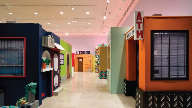
Ana Serrano’s latest work Salon of Beauty replicates the eclectic and funky buildings, façades and signage typically found in lower socio-economic Hispanic neighborhoods. This site-specific work, its grand size laden with tiny details throughout, can be found in the Rice Gallery at Rice University in Houston. It is as much about the architecture of communities as it is about how individual choices mark, morph, and define the visual aesthetic of an urban landscape.
Born in East Los Angeles, Serrano was commissioned by the university to create Salon of Beauty and resided there for a month. Either familiar or foreign to you, her installation and the neighborhood it suggests celebrate a part of the modern city landscape that continually changes based on its inhabitants’ personal tastes; quite the opposite of the design restrictions that often accompany suburbs. The architecture and visual elements in these kinds of neighborhoods mirror the idea that a city is a living, breathing organism: constantly changing, never staying the same.
“Salon of Beauty is mostly about the interactions between homeowners and small business owners and how they alter their personal space. It’s not about the person, but about the decision a person makes, about color and typography and portion, and about how they choose to change their front porch, or what color they choose to paint their house,” said the artist. “There are stories behind there, where you see layers of paint and business signs getting painted over. They’re not clearly defined. There’s no story that has a beginning, middle, or end.”
While her inspiration is drawn from neighborhoods in Los Angeles, the work transcends a specific location. Patchwork urban landscapes made up of brightly painted buildings, bold typography advertising businesses, and building constructions that suggest someone “did it themselves” rather than hiring a professional are found in neighborhoods in big cities all over the world. But her choice in signage and its hybrid vernacular of English and Spanish feels uniquely American.
“There is, I think, for artists, more of an interest in these types of spaces that are a little less refined and pristine. Not to say I don’t like driving through beautiful neighborhoods, but I find this more interesting. I’m not interested in reinterpreting nicer neighborhoods,” said the artist.
Every detail is given consideration. You want to venture inside her buildings. But this wasn’t what she wanted for this work. “A lot of times I am interested in the interiors of places, but for now, I really wanted to focus on the outside and the facades and the experience of traveling through the space. So it was a point not to open any of these up. It would take away from the experience,” she said.
Void of people, the details on the skin of these structures tell us plenty about the spirit of the folks who run the businesses, live in the buildings, and walk these streets. You imagine an old lady tending to her plants behind the burglar bars that wrap around her porch next door to the building with a XXX sign on its front, keeping out the riff-raff. You imagine the cakes created in the sweet shop and the Quinceañeras and large family weddings they will go to. There is enough information for onlookers on this miniature street to capture the essence of its people without having to see them.
“I’m definitely not so interested in the figure, or even showing things in action. I am more interested in the decisions people make, the way they alter their space and the way these communities are laid out. I feel like these details do tell us a lot about the person who lives here. There isn’t really a need to show the person; it’s already here,” says Serrano.
Working with cardboard as her primary medium, this is the artist’s largest project built using this material. The entire piece, with the exception of its wooden understructure and a few wooden dowels here and there, is composed entirely of painted cardboard. Everything from the potted plants to the cinder blocks is constructed with this heavy-duty paper.
But while her vision takes its cue from the neighborhoods in L.A, she is firm in that the work is not a direct replica of any specific building. The buildings are smaller than they would be in real life, a miniature world. One would need to crouch down to enter through any of the doors and shrink a few feet to find comfort inside. There is also a lack of worn signage, dirt, scruff, and human use, which you will find if you set foot into the real world that Serrano has taken direction from. This suggests Serrano’s cardboard world exists as a sort of highly stylized diorama.
There is more I think for artists, more of an interest in these types of spaces that are a little less refined and pristine. Not to say I don’t like driving through beautiful neighborhoods, but I find this more interesting. I’m not interested in reinterpreting nicer neighborhoods…
Though void of appearing grimy and rundown, her bright and flawlessly constructed neighborhood is not a perfect place. Her decision to shine a light on more of a working-class neighborhood by including a liquor store and a strip club weaves an underlying social commentary into her otherwise bright, seemingly naïve world. “People always say ‘Oh, kids will like this,’ you know, and it’s because of the color and the childlike aspect of building miniatures. But I feel like it’s not for kids at all. The topics and the type of places I choose to represent are a little more gritty, like the liquor store, or I choose to add barbed wire to things,” said Serrano.
“I am not representing the ideal neighborhood even, I am representing this neighborhood that is more of a working-class neighborhood where you find people in lower socioeconomic factors. That is where the work should live. Right between this balance. They are these miniatures, and that’s why people see them as lighthearted, but the topics are always a little bit darker,” the artist concludes.
Large cities are defined by diversity and while we’re taught not to judge a book by its cover, this circumstance and Serrano’s fabricated world suggest that we judge spaces and places from the outside in. We do, indeed, judge a neighborhood by its cover.
Posted: May 21, 2012 at 11:51 pm


