Nor Space, Nor Time
Rose Mary Salum
Translated to English by Tanya Huntington
Rose Mary Salum: From the start of your career, the concept of what can be gauged, or how to measure the immeasurable, has been a constant. Can you elaborate?
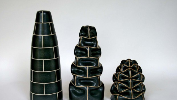
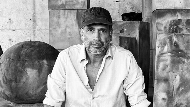
Pedro Tyler: Yes, measurements have been recurrent in my work, although I believe it’s best to say that the constant here has been the immeasurable. In other words, I adapt different materials or objects in order to approach themes that I am interested in and that, in general, unite elements that are paradoxical, or that might seem to have contradictory explanations. For example: a deaf man composing music, a rainbow at midnight, an artist whose creativity was ended by his own hand. Twelve years ago, I ran across this phrase in a book: “Measure everything you can, and make whatever you can’t measurable.” This became the catalyst for a series of works with rulers, tape measures, and slide rules. Somehow, what this phrase did was lend clarity and focus to my work. At the time, I was working in connection with my family history–distances, absences, feelings–and little by little, I starting sectioning rulers as a metaphor for all those things that cannot be measured. Then I started joining together some rulers and articulating them with others, which made the numbers or the complexity required to understand the system “grow.” Therefore I can say that yes, indeed, I am interested in the measurable, in rational capacity and obsession. But from the inside, so to speak. Thus, I can point out the fissures, the edge from which an ever-present immensity has emerged.
RMS: The yellow ruler, an object that is so prevalent in your work, was previously used by Brazilian artist Meireles. What attracts you to his work, and what sets you apart?
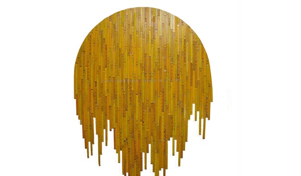
PT: When I started working with rulers at college, a couple of professors made comments to me about Meireles’ work. There, I became better informed about his art and saw that it was geared towards different things. It seemed interesting to me to work on something that had already been worked on by another, but doing it my own way, appropriating the material in a manner different from Meireles and other artists who have worked with or on this object. I would say that is what brings us together, because by choosing the same ground, we share a certain interest in the objects being selected. As a major practical difference, I would say that Meireles alters the ruler as an inudstrial ready-made, comissioning rulers with rearranged scales and numbers. I, on the other hand, work with found objects, altering them with my own hands. The most common rulers used to be yellow, which is why I started out working with those. Several years later, I found white rulers, and not long ago, an entire array of colors, which I have gradually incorporated into my work. Not to mention stainless steel, acrylic, and aluminum rulers. Conceptually, I use rulers as a symbol of reason in order to speak, among other things, about nonsense, whereas I believe Meireles uses them, like bills or Coca-Cola bottles, to highlight the arbitrary nature of patterns, whether they are measures or the value adjudicated to a piece of paper.
RMS: Yet in your more recent exhibitions, I perceive a new concern: spatial layouts. Can you tell us a little more about that?
PT: Actually, spatial layouts have always been present. I recall the first day a college drawing professor asked us what we wanted to be. There was total silence. Then I answered, “I want to be a sculptor.” To me the initial idea, the initial problem, and the initial response is always spatial. I consider myself to be a traditional sculptor, no matter whether my works are videos, photographs, objects, etc. My way of confronting things is always spatial. And in light of the spatial layout of a show, I try to have the different works situated–or rather, I try to situate the works–so that they interact, but moreover and perhaps most importantly, I consider how they are going to interact with visitors. Here again is the issue of proportion, or of measurement, and measurements are corporal issues, definitely spatial. Looking up or looking down, walking toward the sides, seeing oneself reflected in a work or throwing one’s shadow. Each one of these aspects has its interpretation. And I believe they enrich the experience of each artwork.
RMS: Going back to the first question: to be more specific, when you talk about opposites, there are two positions that seem to stand out in the body of your work. These are life and death, light and shadow. Can you tell us more, especially with regards to death and shadow?
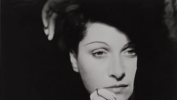
PT: Hmmm, you know, it’s not that clear to me. I don’t believe they are such opposite concepts, I prefer to think of them as counterpoint. For my college thesis, I spoke about counterpoint between ideas or materials; for example, when you put two similar things together, their differences are highlighted. But yes, as you were saying, these themes are present in my work. In fact, they generate practically all of my work. But I do not see them as being so contrary. To me, life and death are one, perhaps because of my religious beliefs, and while the most common way of thinking about death is to relate it to shadows, to me, death is light. Then there is the experience some have had when they are close to dying, of seeing a light at the end of a tunnel, or the Buddist concept of dissolving into oblivion. That oblivion, that nothingness, can be both darkness and blinding light. If I had to compare light and shadow, I would say that to me, shadows are the past, and light is the present. The light of the soul, the shadows of the body. And since we are on the topic of portraiture, every time I run across another artist who has taken his or her own life, it saddens me. Perhaps that is why I work with them. In a certain way, these people continue to live through their legacy.
RMS: Not Space, Nor Time. How did you come up with this title, and what is your primordial concern?
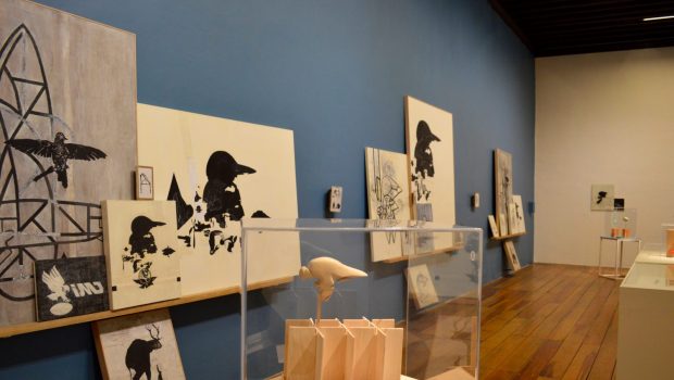
PT: Generally, while preparing a show, there are several common threads that guide my work in the studio. On the one hand, I had been working on and researching this series of works regarding the light and shadows of artists who had committed suidice. And delving futher into the work of one of these artists, Gilles Deleuze, I found the book Painting: The concept of diagram, which is an account of some of his classes Deleuze that approached the influence or relationship between painting and philosophy. During these classes, he talked a lot about color and, among other things, he would ask: What is color? And then he would say: Color is not space, nor time; the optic qualities of objects are what reflect the colored light. And since I was delving deeper in terms of light and shadow, I found Color, and this meant realizing that color is light. It is a certain kind of light. In the same book, he also speaks of the fact that colors are dirty or clouded light. This idea that color can be explained by something “negative” lent meaning to what I had wanted to do for years, gathering into a single work several artists who took their lives. Thus Darkening the Light came together, a work of 90 portraits of artists organized alphabetically and in primary colors, plus black and white, depending on their professions. Then it was as if every last chip fell into place. Down to every last detail, even the fact that my exhibition would be held at the same time as that of Carlos Cruz Diez. And it truly motivated me that the show would orbit conceptually around color, that it would share a common thread with the other show in the same gallery. On the other hand, like I said before, while I consider myself to be a sculptor, sculpture is the exact opposite of the title. Sculpture is space and time, and color is not generally one of the specific or fundamental themes of sculpture, unlike form, material, weight, etc. In my preivous works, there was no such focus on color or the combination of colors in a work, and here also Deleuze had something to say. He spoke of artists who took their time mastering color and used as an example Van Gogh, who in his early works used earthy tones. Once he had succeded in mastering color, he killed himself. This is not the case with Rothko, whose final years are the darkest, even though he used to say that black was just another color of light, something that can be appreciated in the Rothko Chapel and the Menil Collection, a few steps away from this gallery. Thus I found it interesting to base myself on these three artists: Deleuze, Van Gogh, and Rothko. Working with regards to their experiences, concepts, ideas, colors, and forms.
RMS: Your work is strongly influenced by other disciplines, such as philosophy (Descartes), or literature (Akutagawa). Do you believe that visual arts ought to be based on more well-rounded proposals, like yours? This is a pertinent issue, because some artists are more focused on visual rather than ideological aspects.
PT: To me, the greatest error lies in believing that art must be something well-defined, figurative, abstract, intellectual, etc. Largely because that is a mistake that I made. At one point, I was set on abstract art. And given that as a child, I listened to a lot of classical music, one day while reading Kandinsky (when I was older) he gave classical or instrumental music as the greatest example of abstract art, and that made me see things differently. I don’t believe there is only one right way to make art. Each person has to seek out the form that suits them most. I am interested in the conceptual side, but I do not push aesthetics aside. It is true that I do a lot of research through reading, observing, listening to music, philosophy, and literature, which inspires me. But in the end, what I do is visual, and so I seek out a middle ground between form and content. I am interested in the struggle that arises whenever one sees artworks and they tell you one thing, in terms of the senses, but through the title or the text, other information is generated; looking back, I am contrasting layers of meaning. Moreover, often the kickstart in these works is purely intuitive, and as I go along, I gradually find new meaning. On the other hand, I am aware that while I do use titles that speak of myths, legends, or ideas that form part of fairly basic knowledge, if someone does not possess that cultural baggage, it’s as though my works have no ideology and will be interpreted as purely visual. Such are the rules of the game.